
Wiz Win
Brand Design Challenge| Project Year - 2023

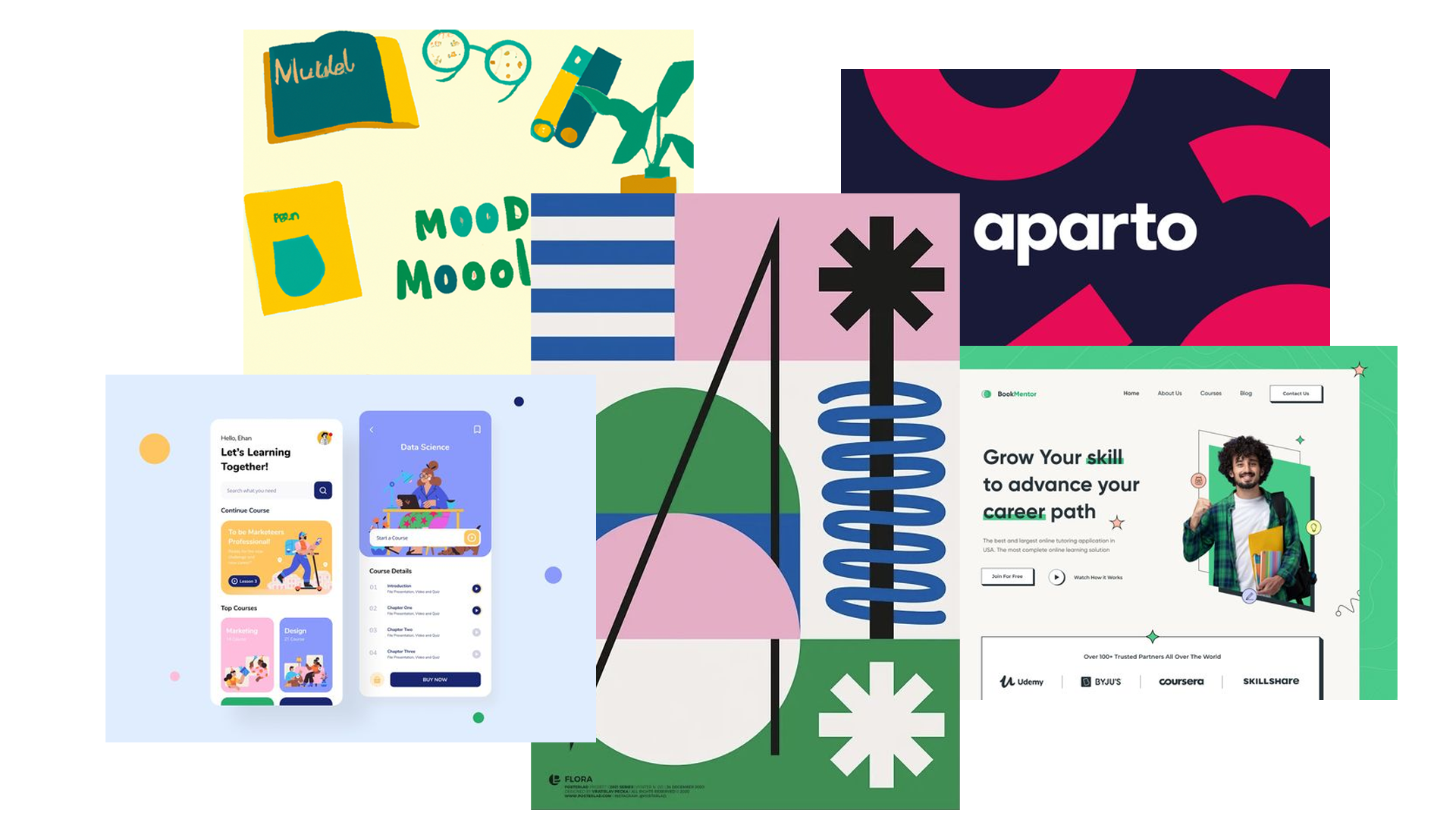
DELIVERABLES
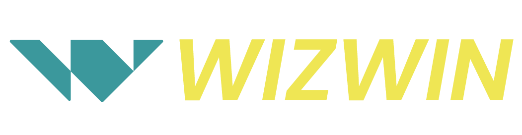
Logo
App UI Screens
Website UI
SERVICES
Brand Identity design
CHALLENGE
To choose a brief from a set of premade briefs and work upon it.
OUTCOME
The outcome is a collection of deliverables which includes, screens, and posts an logo explorations
Background of the organisation
Wizwin is a new Edutech start-up company that has entered the growing edutech segment. The differentiator that Wizwin offers is that the platform gives personal attention to each student. It is aimed at new-gen parents who do not believe in rote-learning, but rather want their children to learn through understanding of core concepts.
Positioning of the brand
Learning smartly to win.
This positioning statement emphasizes that the platform and app are geared towards new-age learning, which is not just about working hard, but also about working smart and efficiently to get the desired results.
The process
PHASE 1 –
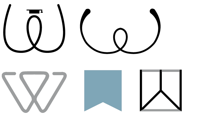
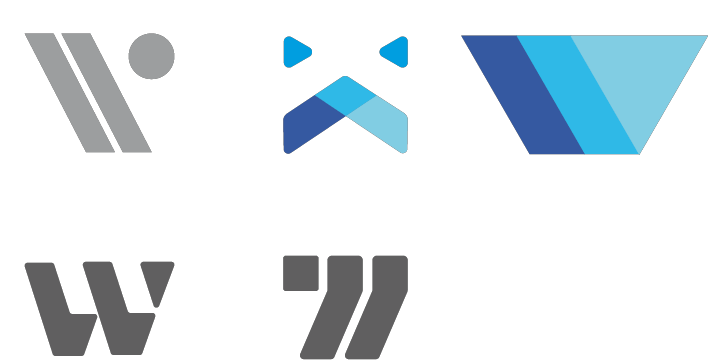
Starting with the ideation of the logo based on the data provided, the brand needed a modern logo which is not only relatable but very much scalable. Thereby the focus was on making an icon.
Brand attributes
As soon as we were adamant over what kind of services and aesthetics we want to provide, we started building the brand attributes.
Vision
Transforming learning processes and learning outcomes for students.
Tone
•Outgoing
•Smart
•Friendly
Target Audiance
• Students
•Parents
•Subject experts
•Future funders
•Tech partners
Mission
To be a smart study partner and provide engaging education to help students reach their full potential.
Mood Board
The process
LOGO IDEATION
With the brand attributes and story provided. The process started to design the logo for the company.
The explorations and rejected logos are also very sick. I hope you like them.
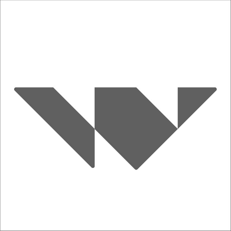
Finalsing the logo
After some tweaks and changes one logo was finalising which was not only perfectly scalable but can be a perfect logo for an Icon too.

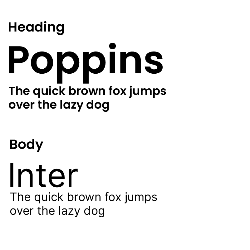
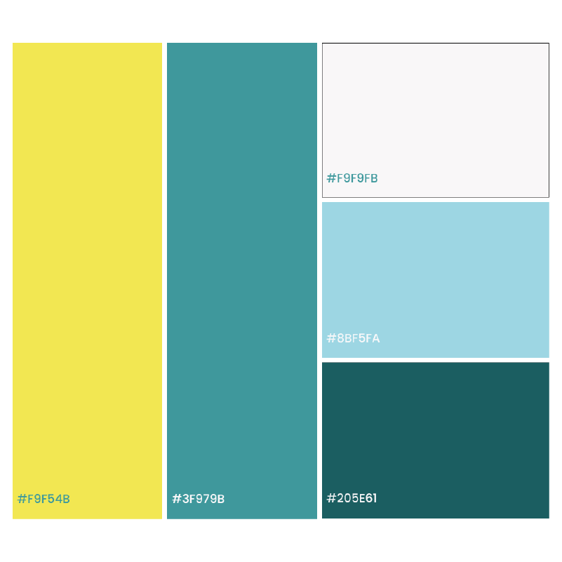
Typography & Color
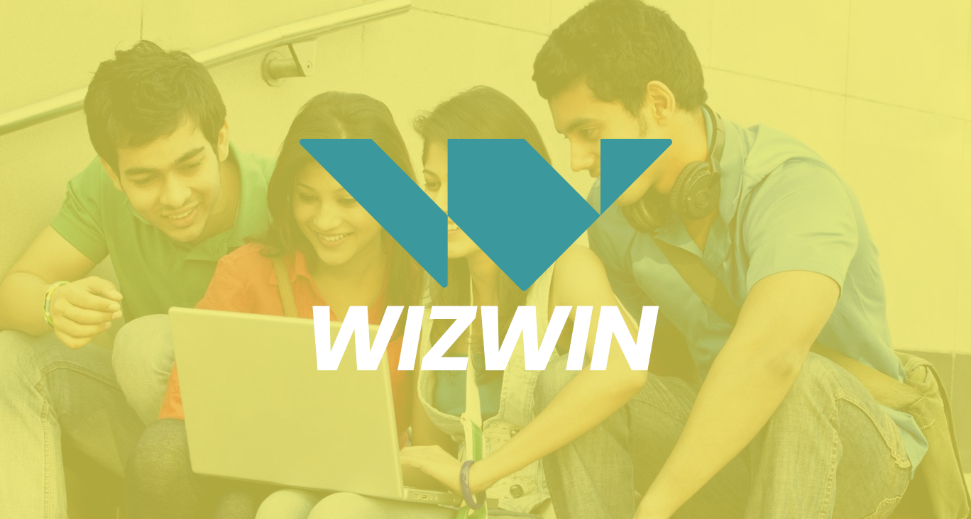
Primary Logo
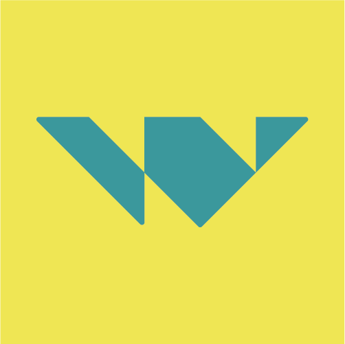
Logo Mark
Clearance Area
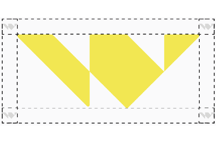
Scale
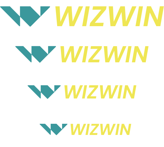
Application Logo
The following is a sample usage of word mark as an app logo.
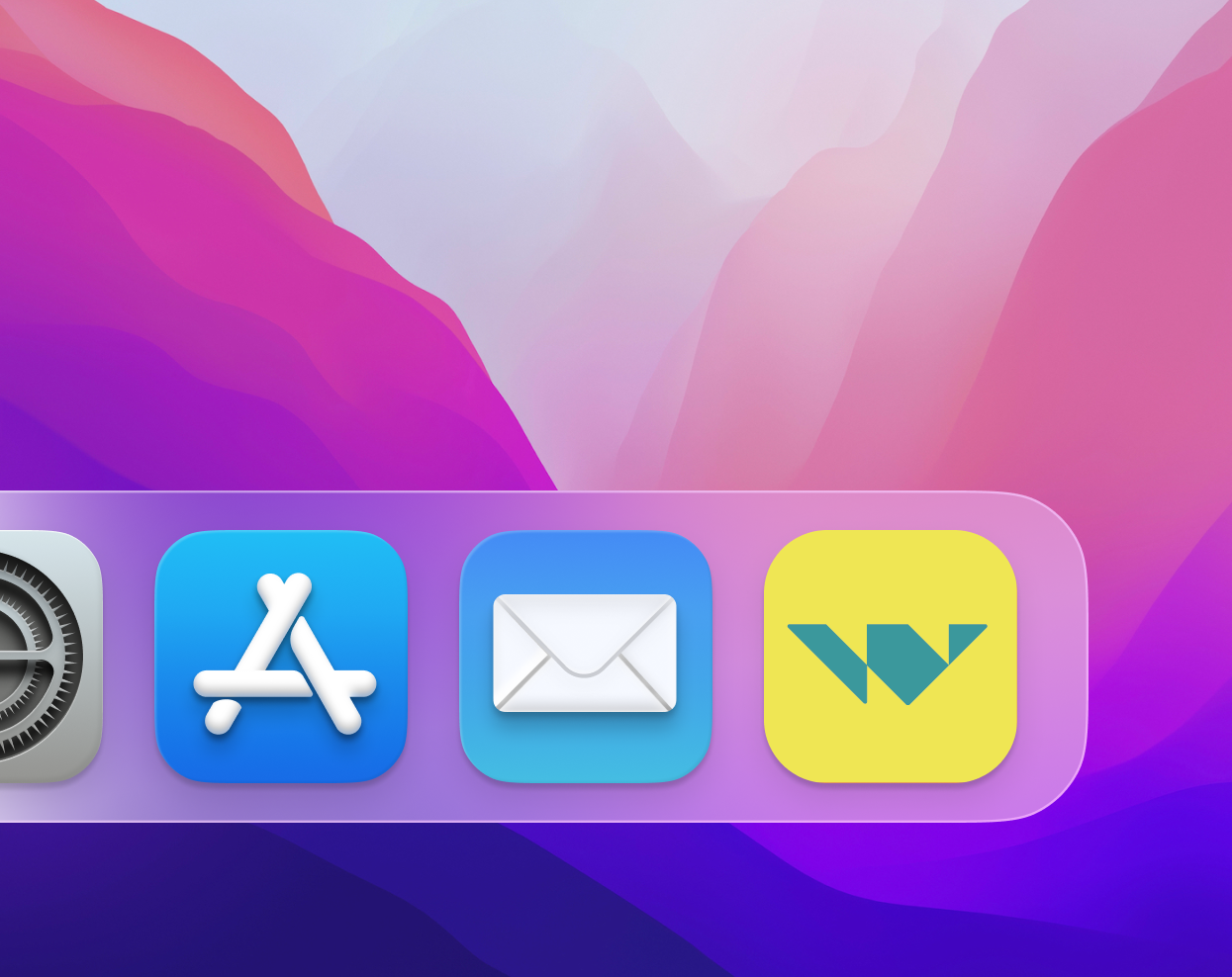
Application
The following is a sample usage of elements. The placement of the logo and elements such as UI details must be maintained as represented. The graphic used as the background can be replaced by new graphics made according to guideline
Landing Page
The following is a sample usage of elements and identity for a landing page design. The usage of elements, gradients, colour and typography have been explored and demonstrated here.
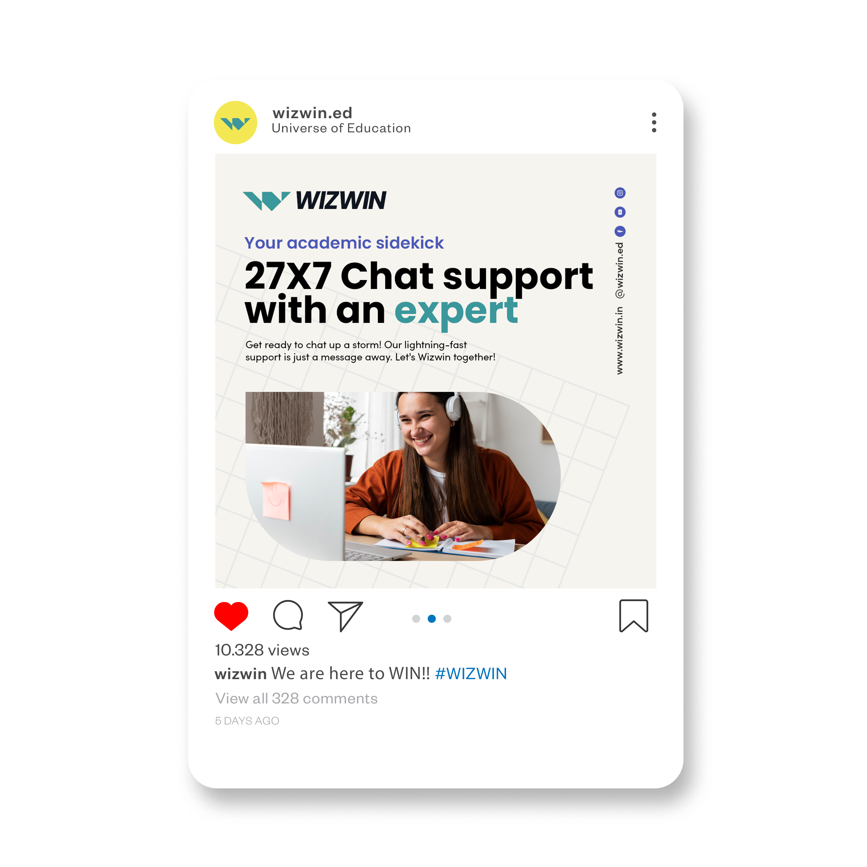
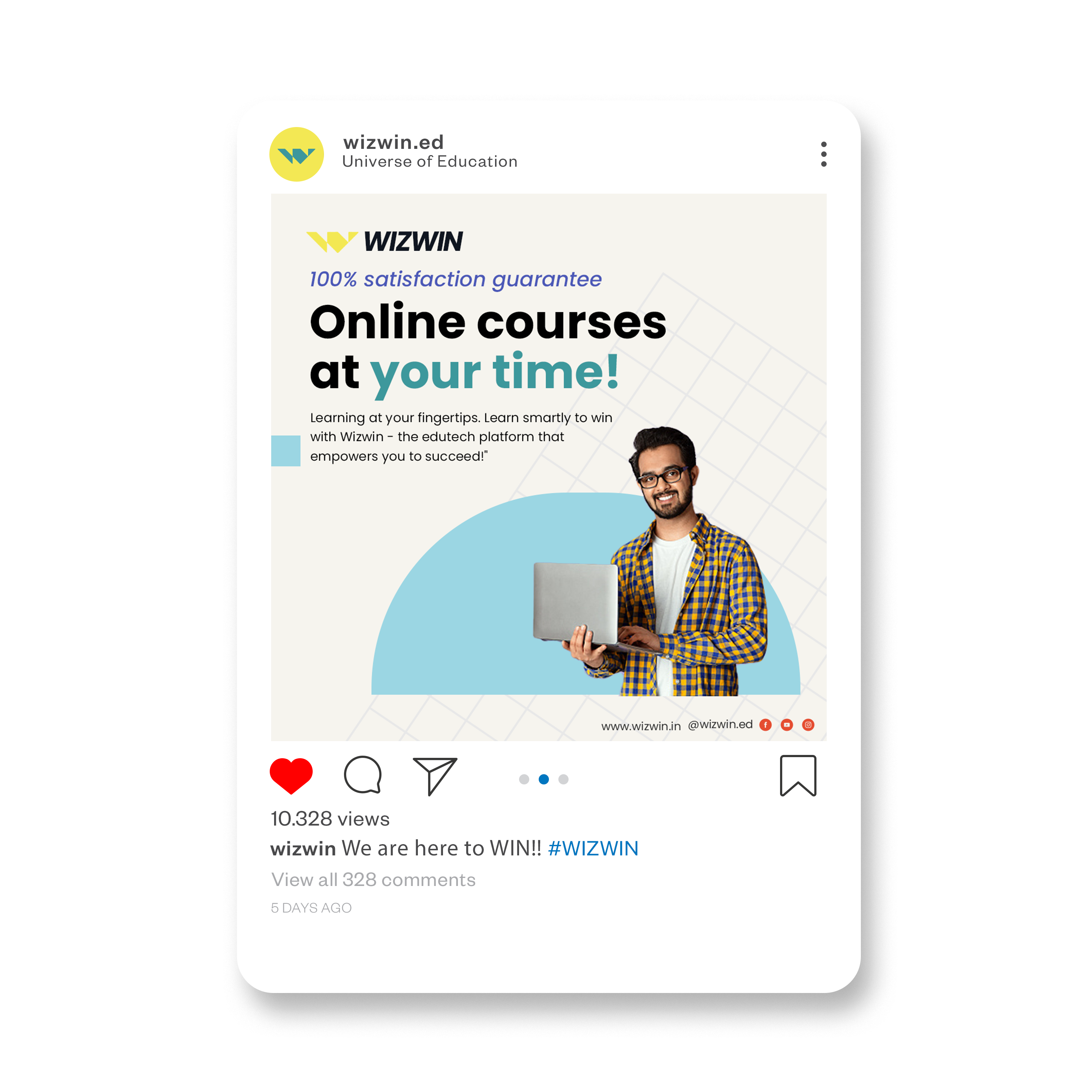
Social Media
The following is a sample usage of elements and identity for a landing page design. The usage of elements, gradients, colour and typography have been explored and demonstrated here.